In this, my first post, I discuss the paper by Bafumi and Gelman. This paper explains why it is problematic if predictors and group effects correlate when doing mixed models, eg lmer, and they also propose a solution.
I recently read the paper, and the code they used to create their plots wasn’t readily avaible to me (or, at least, I couldn’t find it). So, I decided to write my own and post it here, in case others are also interested.
The basic idea is that correlation between predictors and group effects can artificially decrease p-values associated with the predictor, leading to effects that seem more significant than they are. Here are two examples:
- In this example, we have a predictor, response and grouping. There is no correlation between the grouping and the predictor, and there is a relationship between the predictor and the response.
library(lme4)
set.seed(2142018)
no_corr <- replicate(1000, {
pred <- rnorm(100, 0, 2)
out <- pred + rnorm(100, 0, 7)
out <- c(rnorm(25,1,.001), rnorm(25, -1, .001), rnorm(25, 3, .001) , rnorm(25, 2, .001)) + out
df <- data.frame(pred = pred, out = out, units = factor(c(rep(x = 1,25), rep(2, 25), rep(3, 25), rep(4, 25))))
summary(invisible(lmer(out~(1|units) + pred, data = df)))$coefficients[2,3]
})
hist(no_corr)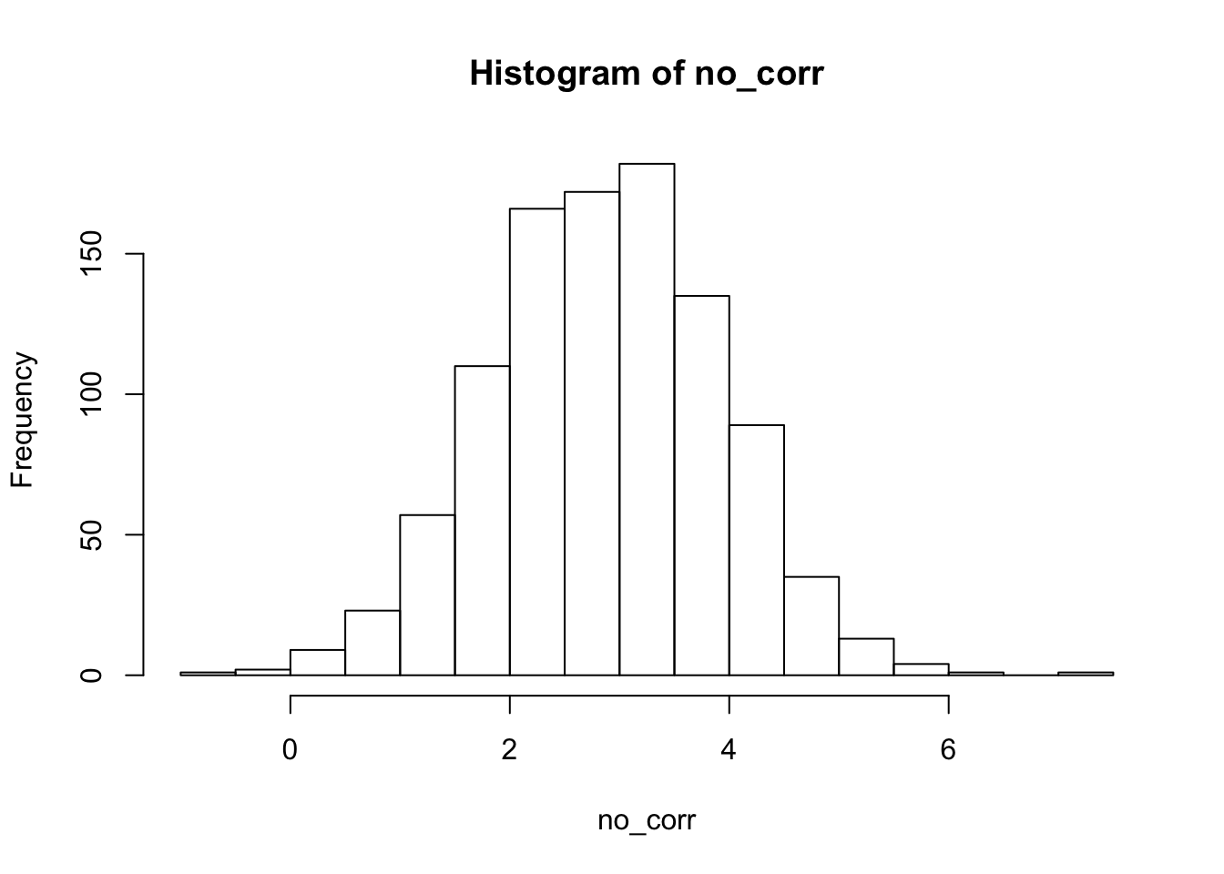 2. Next, we see what happens when there is a correlation between the groups and the predictor. Everything else remains the same.
yes_corr <- replicate(1000, {
  pred <- rnorm(100, 0, 2)
  out <- pred + rnorm(100, 0, 7)
  pred <- pred +  (c(rnorm(25,1,.001), rnorm(25, -1, .001), rnorm(25, 3, .001) , rnorm(25, 2, .001)))
  out <-  (c(rnorm(25,1,.001), rnorm(25, -1, .001), rnorm(25, 3, .001) , rnorm(25, 2, .001))) + out
  df <- data.frame(pred = pred, out = out, units = factor(c(rep(x = 1,25), rep(2, 25), rep(3, 25), rep(4, 25))))
  summary(lmer(out~(1|units) + pred, data = df))$coefficients[2,3]
})
Now, we compare the histograms of test statistics associated with the slope of the predictor variable in the two scenarios. As you can see, there is a difference in the two histograms, and the correlated version has significantly higher test statistcs overall.
corr <- data.frame(no_corr = no_corr,
                   yes_corr = yes_corr)
library(ggplot2)
library(dplyr)
tidyr::gather(corr, key = "corr", value = "t_stat") %>%
  ggplot(aes(x = t_stat)) +
  geom_histogram() +
  facet_wrap(~corr)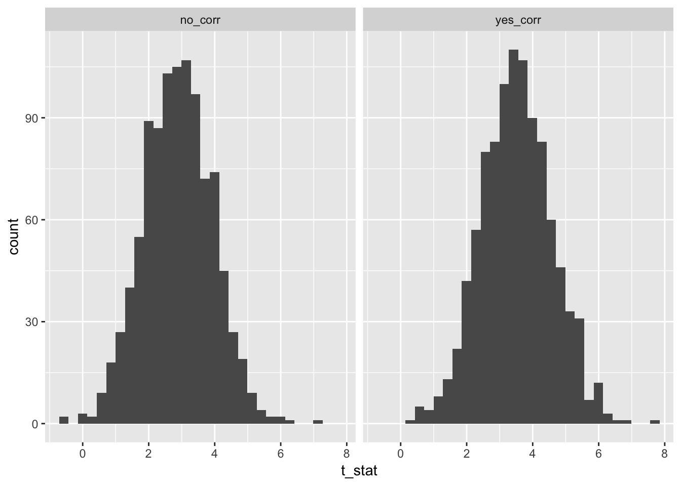
Well, the histograms may not be that convincing, but the means are.
mean(no_corr)## [1] 2.879333mean(yes_corr)## [1] 3.509314t.test(no_corr, yes_corr)##
## Welch Two Sample t-test
##
## data: no_corr and yes_corr
## t = -13.39, df = 1996.4, p-value < 2.2e-16
## alternative hypothesis: true difference in means is not equal to 0
## 95 percent confidence interval:
## -0.7222483 -0.5377140
## sample estimates:
## mean of x mean of y
## 2.879333 3.509314